Colour is the easiest way to make a page feel finished — and the easiest way to hide that nothing else is. When I rebuilt this site I set one rule for myself: black, white, and whatever greys fall between them. Everything that used to be a colour decision became a decision about contrast, weight, or rhythm.
This post is a tour of what that rule changed.
Type does the heavy lifting
With no colour to separate a heading from a paragraph, typography has to carry the hierarchy on its own. Two faces are enough:
- A display face for page titles and the site name. It should have real personality, because it appears rarely and sets the tone.
- A workhorse sans for everything else — body copy, navigation, in-article headings. It needs a proper range of weights.
In-article headings deliberately use the workhorse face at a heavier weight rather than the display face. Display type in the middle of running text shouts; a heavier weight of the same face just speaks up.
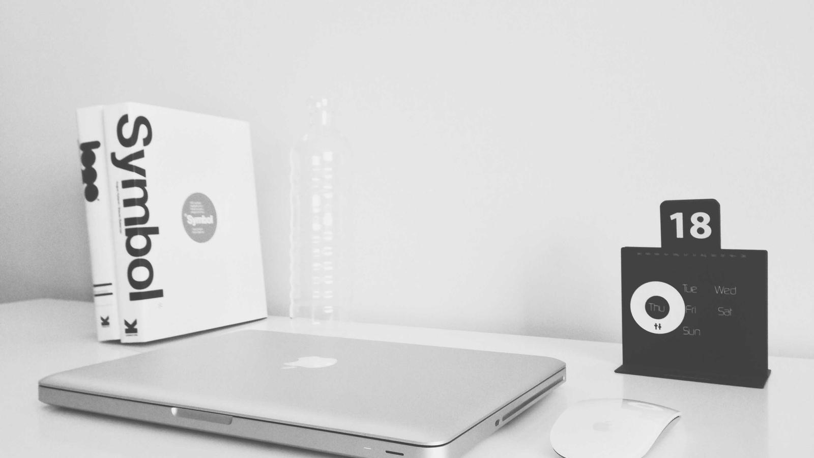
Borders instead of backgrounds
Coloured backgrounds group things. Without them, thin borders do the same job with far less visual weight:
| Element | Before | After |
|---|---|---|
| Tags | Tinted pill | 1px bordered chip |
| Project cards | Shadowed panel | 1px border, subtle surface |
| Callouts | Coloured fill | Left border, muted label |
| Quotes | Grey background | A single rule on the left |
The trick is consistency: one border colour per colour scheme, used everywhere. The eye reads the repeated line as a system rather than as decoration.
Where motion earns its place
A monochrome page is calm — sometimes too calm. The animated background behind this text is the one indulgence: a slowly turning field of stars, drawn in the text colour at very low opacity so it belongs to the scheme instead of competing with it.
Three things keep it from becoming noise:
- It is faint. If you notice it before you notice the words, it is too strong.
- It stops when the tab is hidden, and holds still for visitors who prefer reduced motion.
- It can be switched off with a single setting, and it is for anyone who prefers reduced motion.
Restraint isn’t the absence of decoration; it’s decoration that knows when to stop.
What I’d do again
Stripping colour was a forcing function. It exposed lazy spacing, made me pick fonts with intent, and turned motion into a deliberate choice rather than a default. If your site feels busy, try removing colour for a day. You’ll learn where the structure is actually coming from.